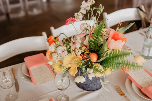
Tired of the usual blush and sage color palette that dominates spring events? Looking for a lively, fresh, and cheerful to brighten up YOUR event? Look no further! Here are 5 bold color combos sure to bring your spring event to life!
Lilac and Peach
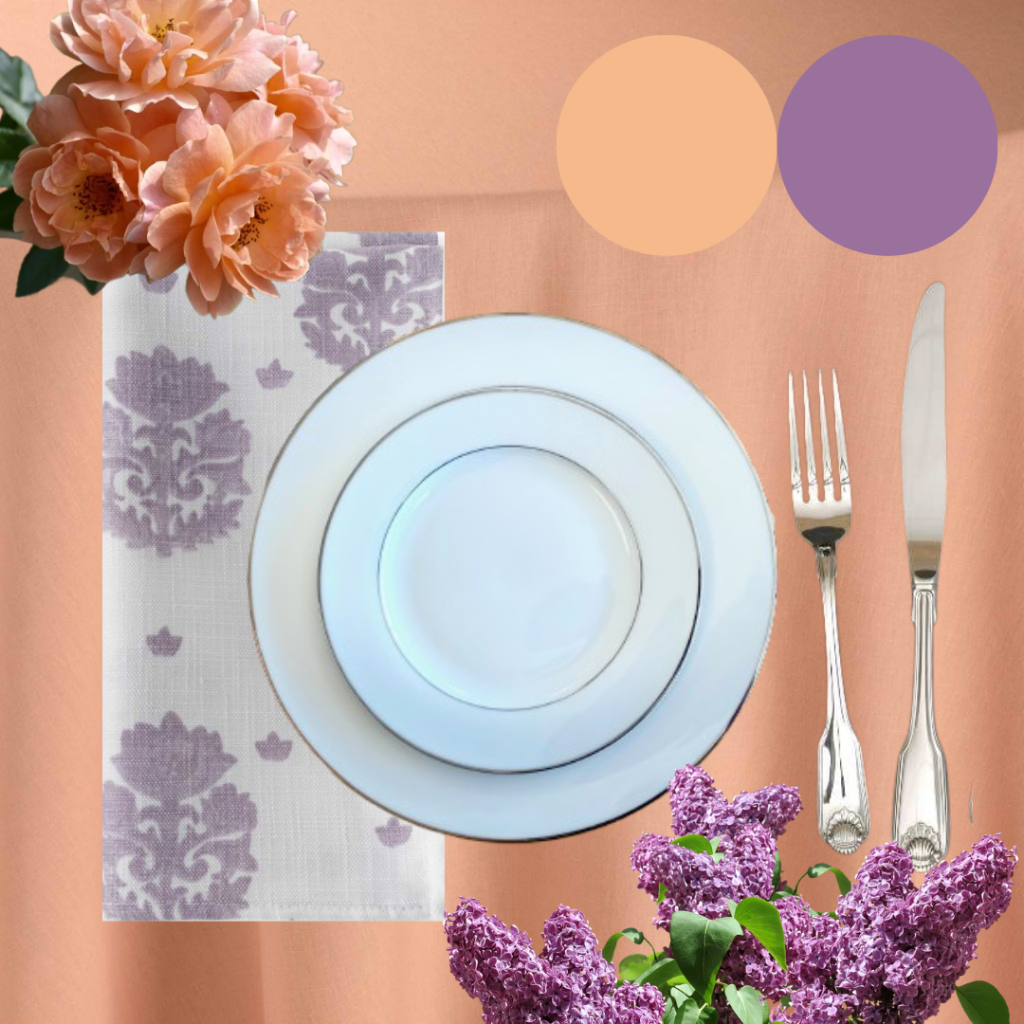
This color combo is soft on the eye with just enough contrast to draw you in, and the light shades are the perfect love letter to spring. To create this look, we chose a crisp pastel peach tablecloth (BBJ Tuscany Peach) and paired it with a white and pastel purple damask-patterned napkin (BBJ Primrose Iris). For the dinnerware we chose bright white china with a neat silver rim, and we chose our silver Shell flatware to accompany the setting. To fully dress this table, create a centerpiece of fresh lilac stems and peachy rose blossoms, and choose vases, place cards, candelabras, and other table adornments in shades of silver and white.
Citron and Burnt Orange
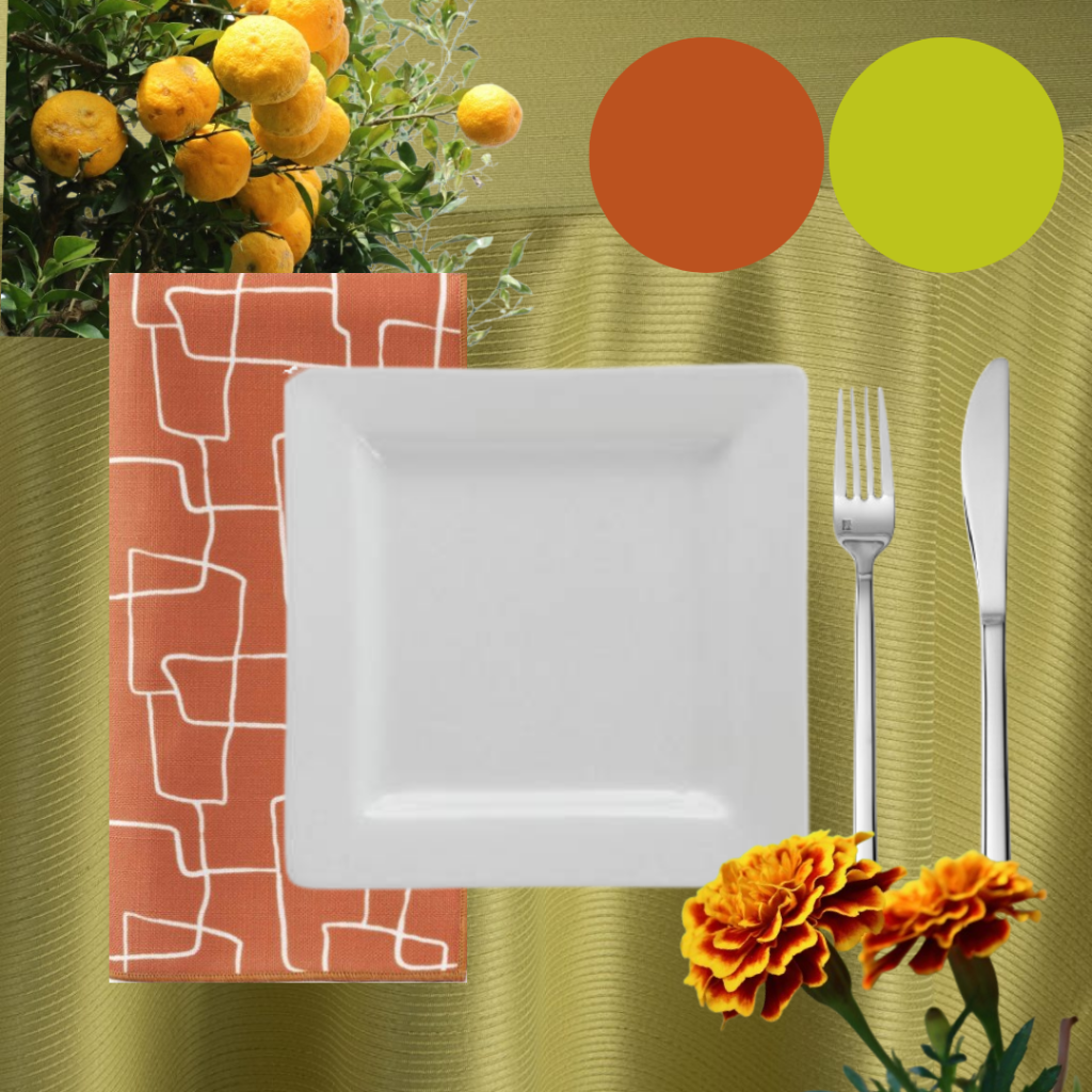
This color combo is bright, punchy, and reminiscent of a glass of lemonade on a sunny spring day. For this look, we selected a vivid yellow-green tablecloth with a subtle metallic sheen (BBJ Radiance Citrine). For the napkin, we chose burnt orange linen with an abstract, modern line art design (BBJ Nouveau Russet). Following the theme of crisp lines and modernity, we chose our white square china and silver Arezzo flatware to complete the setting. To finish this punchy look, you need equally punchy blooms, so choose bright florals like a bicolored French marigold. If you want to add a little extra zing, mix in fresh or dried citrus as well.
Powder Blue, Fuchsia, and Yellow
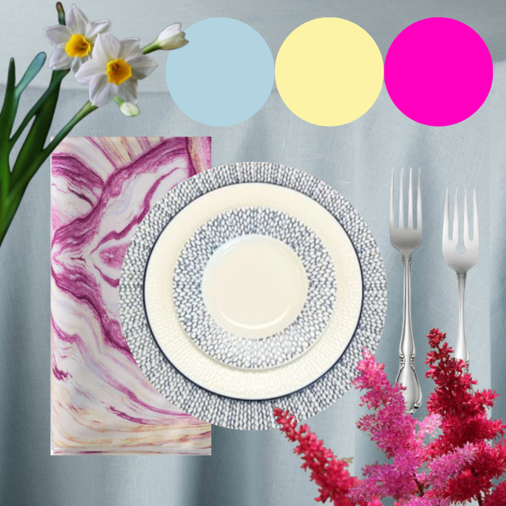
This combo features a refreshing pop of color on a bed of tranquility, like fallen spring petals on a trickling mountain stream. To create this look, we started with a pale grey-blue tablecloth (BBJ Tuscany Ocean) and paired it with a marbled fuchsia and yellow napkin (BBJ Agate Cerise). We carried the blue into the table setting by choosing our Blue Embossed china, and we chose our elegant silver Chateau flatware to accompany it. To finish this look, contrast the blue tablecloth with more pops of bright yellow and fuchsia. Choose eye-catching blooms like bright astilbe, or tune in to the familiar with sweet daffodils.
Orchid and Olive
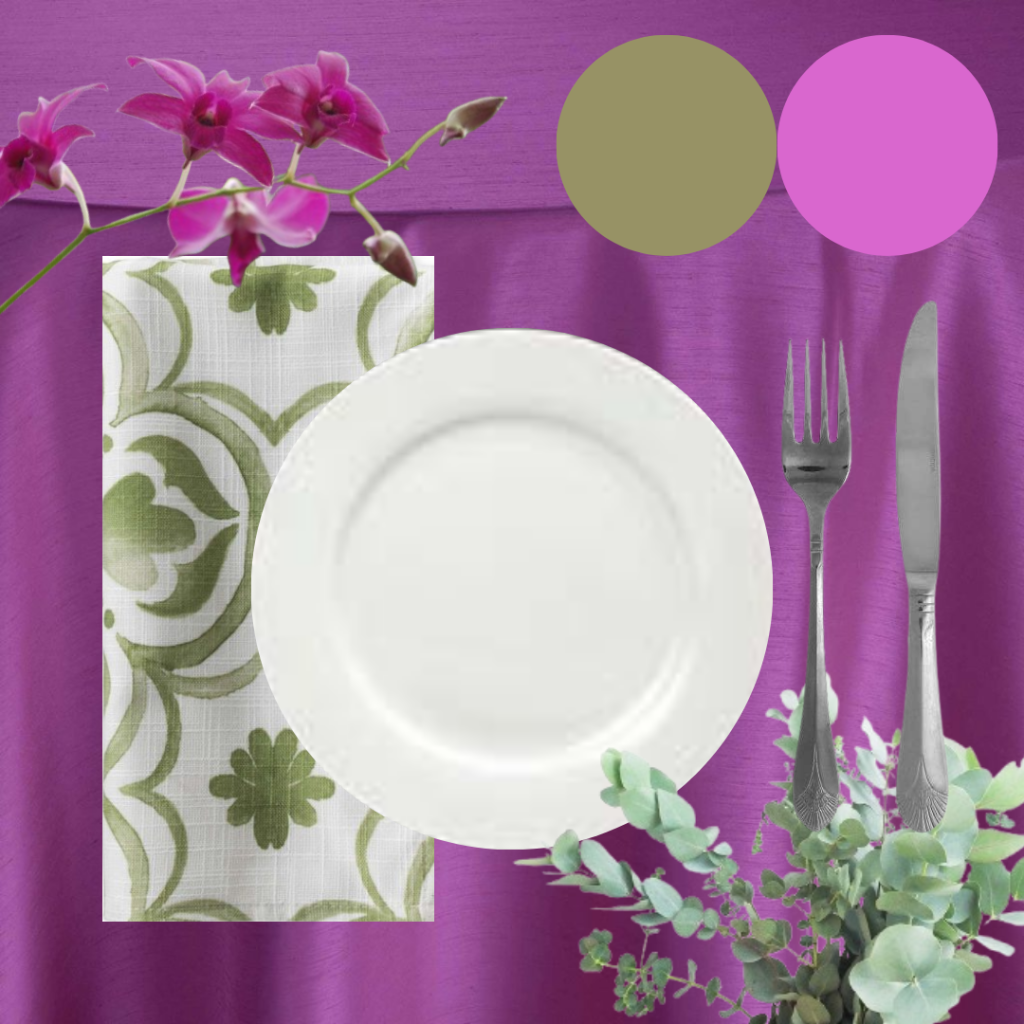
This color combo is bold, sophisticated, and creates a statement. To create this look we chose a silky, warm-toned purple tablecloth (BBJ Shantung Orchid) and paired it with a white and olive-green watercolor print napkin (BBJ Tularosa Yucca). To really home in on a sophisticated look, we chose the simple, clean lines of our white bistro china, and we selected our art deco, silver Plaza flatware to complete the setting. For a color combo with orchid in the name, we would be remiss if we did not recommend you include orchids in your flower arrangements. Be sure to include plenty of greenery as well, such as eucalyptus leaves or fern fronds, to add more contrast to the look and draw more attention to your stunning blooms.
Blush, Pale Yellow, and Espresso
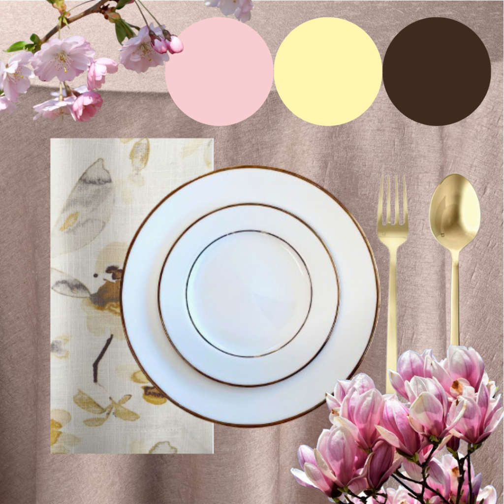
This color combo is soft and warm, like the feeling of sunlight filtering through a blossoming woodland canopy. For this look, we first chose a subtly textured blush tablecloth (BBJ Madeline Blush). Then we brought in the deep brown and pale yellow with a watercolor floral printed napkin (BBJ Harper Yellow Grey). For the dinnerware we selected our gold-trimmed ivory china, and we paired it with our gold Arezzo flatware. To complete this look and bring home the woodland feel, choose flowering twigs and branches to include in your centerpieces and decor. Cherry blossoms or magnolia cuttings are perfect for the job!